A small sample can tell a very big lie.
Win % · Last 365 Days
Angel Armenta
75%
3 wins / 4 starts
Flavien Prat
24%
314 wins / 1,329 starts
No offense to Angel — but I know who I’m picking. Here’s why the math backs me up.
The Problem With Percentages
A percentage is a ratio: successes divided by attempts. The math is simple. The problem is that the math doesn’t know how many attempts there were.
Angel Armenta → 3 wins from 4 starts = 75%
Flavien Prat → 314 wins from 1,329 starts = 24%
These two numbers look very different. And one of them tells you something real. The other is noise dressed up as information.
This isn’t just a horse racing problem — it shows up everywhere people use percentages to make decisions. The pattern is always the same: small samples produce extreme-looking numbers that drift toward something more ordinary as evidence accumulates. The percentage changes, but the underlying truth about the person being measured probably didn’t.
What a “True Rate” Even Means
When we look at a jockey’s win rate, we don’t really care about the past for its own sake. We care about what it tells us about the future — specifically, this race, today.
We’re trying to estimate something invisible: the jockey’s underlying skill level. How often they’d win if they rode in an infinite number of perfectly average races.
The wins and losses we can observe are just evidence about that invisible truth. More evidence means a more reliable estimate. Less evidence means more uncertainty.
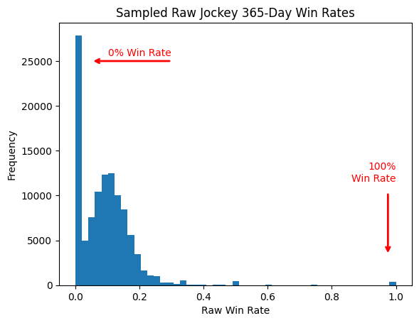
A jockey with 2 wins from 2 starts has given us almost nothing to work with. The truth could be that they’re exceptional — or that they got lucky twice. We simply don’t know yet. A jockey with 52 wins from 500 starts has given us a lot. We can be reasonably confident their true win rate sits in the 10–12% range. The evidence has converged.
The Pull Toward Average (And Why It’s Not Pessimism)
Here’s the key insight: when evidence is thin, the honest thing to do is lean on what we know about the population.
Think about it this way. Before a jockey has ridden a single race, what’s our best guess at their win rate? Probably something like “around the average for jockeys at this level” — roughly 11%. That’s not pessimism; it’s just the base rate. Most jockeys are near average. It would be strange to assume otherwise with no information.
Now they win their first race. Should we revise our estimate to 100%? That would be absurd. One data point can’t overturn a sensible prior. But it should nudge us upward — a little. Win three in a row? Nudge more. By the time someone has ridden 100 races and won 15 of them, the accumulated evidence speaks for itself, and the population average matters far less.
This is the logic behind Bayesian smoothing — the technique we use to clean up win and ITM (top-3 finish) rates before they enter our models. It’s a formal, mathematical way of doing what your instincts should already be doing: treat thin data with appropriate skepticism; trust thick data accordingly.
How It Works
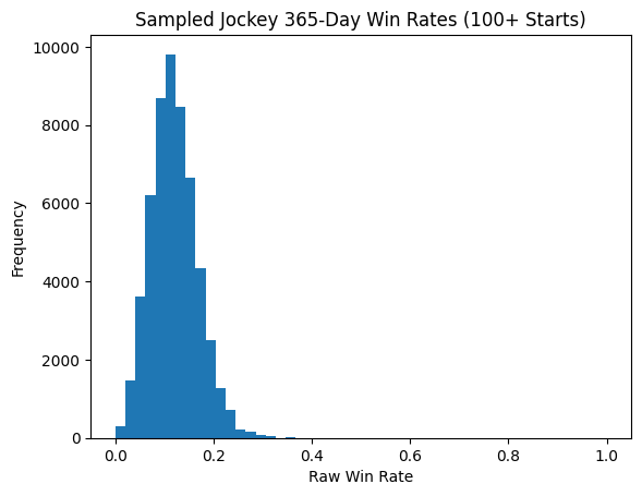
We start by looking at the full population of jockeys with enough starts to be reliable — anyone with at least 100 rides. We ask: what does the distribution of win rates look like across this whole group?
That distribution becomes our prior — our starting assumption before we look at any individual jockey’s record. Now, when we calculate a smoothed win rate, we blend their observed record with that prior, weighted by sample size:
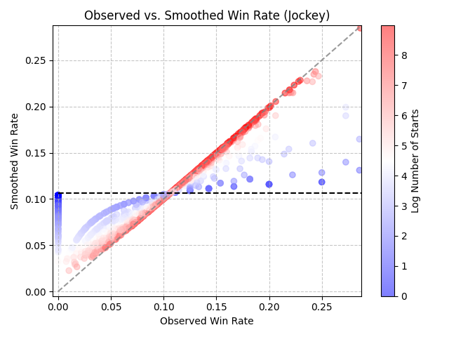
The exact formula isn’t the point. The behavior is:
- Very few starts (dark blue dots) Your smoothed rate is pulled strongly toward the population mean. You get moved toward the horizontal dotted line. We don’t trust the thin record yet.
- Lots of starts (dark red dots) Your smoothed rate closely tracks what you’ve actually ridden. You stay along the diagonal — your record speaks for itself.
- In between? You get a proportional blend. The more starts, the more your actual record dominates.
The Same Logic for Trainers and Track Bias
We apply this smoothing to three things in our model:
- Jockeys Obvious reasons. Riding skill matters, and small samples mislead.
- Trainers Same problem, same fix. A trainer with 1 winner from 3 starters shouldn’t be treated as a 33% winner. The smoothed rate pulls them toward the ~11% trainer average until they’ve proven otherwise.
- Track / Surface / Post Position combinations Does post position 1 at Belmont on dirt win more often than average? Maybe. But if post 1 has only run 8 races in your dataset, you don’t really know yet. We smooth these values toward the track average until enough evidence accumulates.
Final Thoughts
After smoothing, the picture looks very different:
After Bayesian Smoothing
This feels right. The math is doing exactly what a sharp handicapper’s instincts should do — it looked past the flashy surface number and asked: how much should I actually believe this?
Flavien Prat is good. Now I can get some sleep.
Comments
No comments yet. Be the first to share your thoughts.
Have thoughts? Sign in to comment.